Designing a modern, accessible and user-friendly webmail system is one of BlueMind’s challenges for 2019. But how can we achieve this effectively? And what for?
UX, just frills?
UX — short for User eXperience – refers to users’ overall experience when interacting with a product or service. It encompasses the product’s visual aspect (design), usability (features and effectiveness), and overall feel (is the software easy – or even pleasurable – to use?).
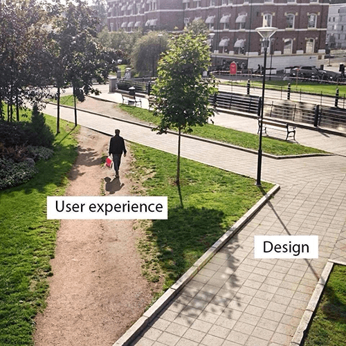
Unlike this, for instance!
Design refers to the UI’s “prettiness”. It portrays BlueMind’s identity and must be consistent throughout the software suite.
Today, email is a key tool, both for businesses and individuals, whether they’re using a thick client such as Outlook or Thunderbird or a web client. As such, the design of any email application must meet very specific rules that concern, among others, user habits: e.g. two or three-pane user interfaces.

Two-pane UI

Three-pane UI
Usability
“Usability […] is the ability for an object or service to be used by a person, according to the purpose it has been designed for”.
For a web application, usability is built on four criteria:
- Effectiveness, i.e. the ease with which a user reaches their objective
- Learning curve
- Ease of appropriation and memorisation
- Reliability, i.e. low bug rate

UX vs design only
Overall feel
The application’s overall feel is both about usability and design. It’s reflects the user’s satisfaction with the interface.
UX strategy implementation – Getting the players involved: a technical and human challenge
In a typical organisation, design, features and product feel are often compartmentalised into silos. In an agile environment, Product Owners collect user requirements and define the feature to implement, and developers select and develop the best technically-suited solution. The feature is then rolled out to all users.
Without a UX strategy, the issue with this workflow is that it will result in a technical and feature-oriented product: i.e. it has all the features needed, it works well, but using it can be tedious.
The UX manager’s role is to instil UX principles at all decision levels (design, features and development) and set quality standards that will help achieve a smooth user experience.
BlueMind’s UX Strategy
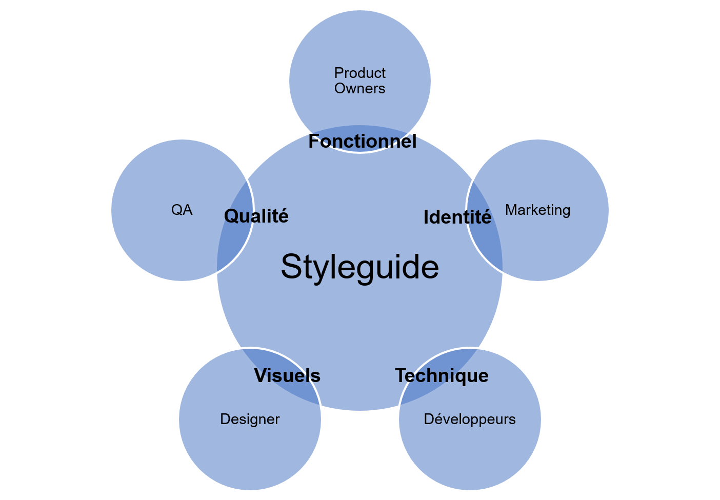
At BlueMind, we’ve built our UX strategy on two key pillars. First, we’ve created set of guidelines for good practices and graphical components open both internally and externally: the style guide.
This style guide is designed to help all BlueMind players.

Product Owners rely on a set of specific style guide rules when writing new specifications. E.g. the rule about minimising the number of clicks forces them to think about efficient features and avoid cumbersome processes such as successive windows.
The Marketing department defines the BlueMind identity: colours, icons, fonts and the overall tone of the application.
Developers can pick straight into the code when they need a new feature. The guidelines help make the process responsive: when a component in the style guide is modified, it will be modified across all BlueMind UIs, thereby ensuring overall consistency.
Designers have a list of the solution’s existing graphical components and produce designs that help enrich the style guide.
The QA department can refer to the style guide when testing new features or to make sure that UX rules have been met.
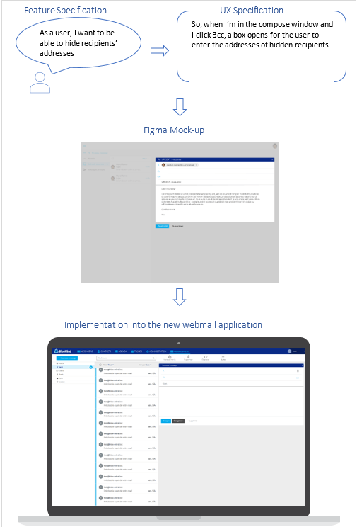
Second, we put UX at the heart of the agile process by adding new UX specifications when creating new User Stories (feature specification). When a new US needs to be specified, the PO talks to the designer, the developers and the UX manager about the feature. The designer creates one or several mock-ups using Figma, a collaborative tool (www.figma.com). Just like specifications, the mock-up can evolve during the development phase, as needs or issues arise. Modifications must be approved by all US players: PO, designer, developers and UX manager. At BlueMind, a review meeting is held on Monday mornings and open to all.

Thinking ahead
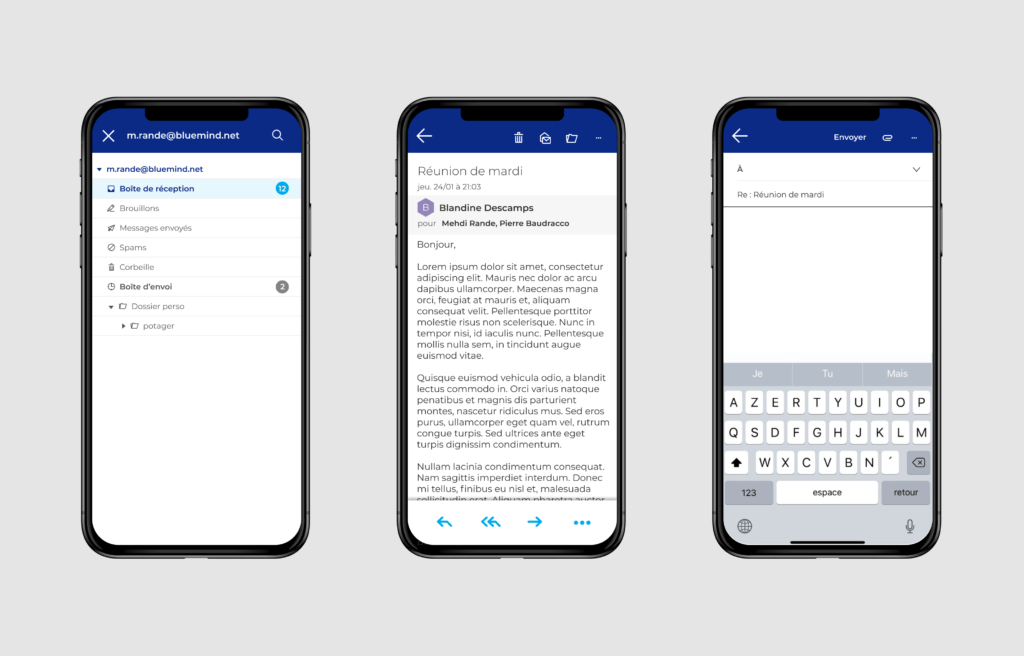
Building a UX strategy for our new webmail is also an opportunity for us to think about updating the technical side of the BlueMind solution using VueJS and web services. It will then be easier to implement features such as offline or mobile device navigation.

Mobile version of BlueMind’s webmail
What next? A complete overhaul of the BlueMind solution!
References:
https://www.usabilis.com/definition-utilisabilite-usabilite/
https://blog.thiga.fr/glossaire/definition-user-story/
https://www.interaction-design.org/literature/topics/ui-design


