“Clients don’t want source code, they want a solution”, Pierre Baudracco, CEO of BlueMind, says when asked about what it means to be an open-source software publisher. As they gradually shake off their time-worn stereotype as geeky, obscure, complex and insider-only, many open-source software publishers are focusing on uses, and they are every bit as good as their proprietary counterparts. They are keenly aware that a transition towards more global and more virtuous technologies can only happen with more open source, by putting user comfort at the crux of the game.
Let us show you how BlueMind puts technical enhancements at the service of improved user experience (UX).
Why user experience matters
Last 25th January, France’s national railway company, SNCF, launched “SNCF Connect” – a new overhauled version of its ticket booking app. The purpose behind this revamp was twofold: to have all SNCF services in one place and enable door-to-door journey planning including other travel methods.
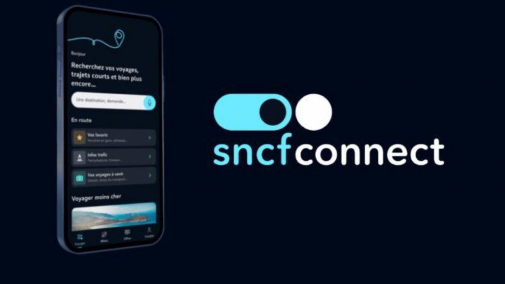
The company heralded “An innovative, different design that won’t leave you indifferent”. If internet users’ backlash is anything to go by, they got that last part right. “It’s a crying shame”, “Terrible”, “Unreadable”, “Hellish”, “A disaster” are just some of the comments on the App Store.
Worse yet, users have rushed to competitors’ applications! The story made it across the French news media, some of whom went as far as to call it an “industrial disaster“. SNCF itself had to make an official statement to account for its actions.
It is natural for users to resist change, and the app has received some positive reviews after a time of adjustment. However, specialists do say that SNCF Connect has a key design flaw: it does not meet users’ needs – namely, being able to book a train ticket easily.
That’s what UX design is for: making sure that an application meets users’ needs intuitively and smoothly, with as little friction as possible. More baffling still, this comes four years after Linh Dao expressed her dismay at how UX design fails still existed…
Now let’s take a dive into BlueMind’s UX-based development process and how we put users’ needs at the heart of our entire approach.
Key UX development points at BlueMind
A small caveat first: the blog article format constrains us to outlining BlueMind’s UX development process as a linear series of steps while in fact, it’s an iterative process.
- Understanding users and their needs
- Who are our users?
- What are their habits?
- What are their needs (habits don’t always reflect actual underlying needs but cannot be ignored altogether)?
- What are their expectations?
- What are their constraints?
To answer these questions, we rely on several sources.
First, we are users of our own solution. Beta versions featuring the latest developments are first rolled out in-house and tested live by our teams.
Second, we analyse current users’ feedback. Our support and sales teams are in constant contact with our clients and we use a series of reporting processes such as the Suggestion Box. The Suggestion Box is solely dedicated to feature and enhancements requests to avoid queries or feature requests polluting the bug tracker which must stay on its own focus, i.e. bug reporting and follow-up. The Suggestion Box also forces users to perform a qualified search before entering a new feature. This avoids duplicates and helps us assess weight/priority level based on the number of requests.
Finally, the trade shows our sales teams regularly attend and our marketing department’s competitive intelligence tracking also provide essential insights.
All in all, this means that all company departments come into action around new projects through design thinking.
- Writing out use cases
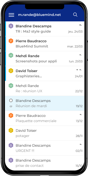
Email being such a commonly used and widespread tool, its typical features are well known. What we therefore try to do is dissect each feature in fine detail to improve/streamline how it is used and come up with new use cases.
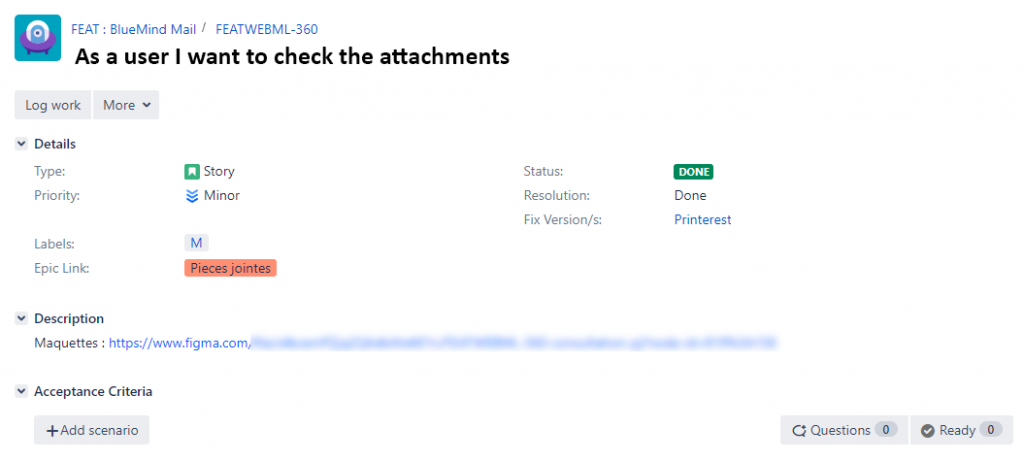
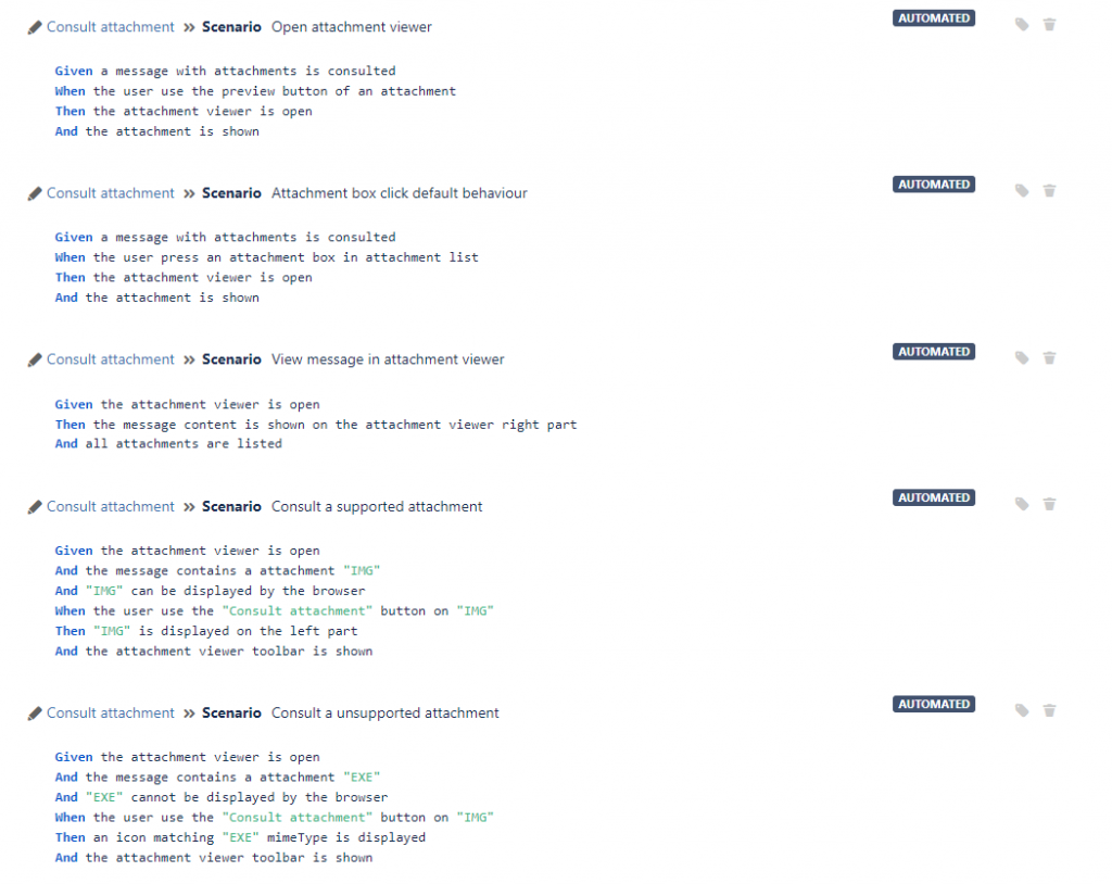
We write out scenarios to help us understand how the application is – or will be – used. For instance, in the previous step we identified users’ need to preview message attachments. Starting out from this, we produce different use cases such as opening a preview pop-up window, navigating between views, controlling a video, etc. This also helps us think about new uses such as providing a better view for attachments on a specific type of screen for increased comfort.
Once users’ needs are formally recorded, they can be reviewed, iterated, and validated.
- Roadmap
The product we want to develop has to fit within BlueMind’s overall company strategy, our long-term vision. This means offering a truly sovereign and virtuous alternative to foreign providers of email – the number one business tool. This meta-objective has multiple offshoots such as “engaging users”, “committing to our ecosystem”, “being transparent”, etc.
The roadmap stage involves documenting both high-priority features and less essential ones in terms of product philosophy, as well as, obviously, technical constraints.
The roadmap therefore not only helps set priorities but also anticipate future evolutions and deliver a coherent set of features. It is not, however, a legally binding document. By definition, a software publisher’s roadmap is ever-changing and non-biding. We have a good idea of what our macro, confirmed or nearly completed projects are, but the whole thing is subject to the hazards of the trade: R&D is full of uncertainties, clients are many and varied, and priorities and risks come and go as projects progress.
- Mock-Up
The UI – User Interface – is the visible part of UX. It is what people see, i.e. anything to do with graphics, display and layout. So, beyond what an application looks like, UI also includes accessibility – its ability to be used by anyone regardless of their equipment, software, language or even disability.
The mock-up stage is therefore the stage when UX meets UI as use cases come to life through the user interface.
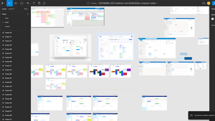
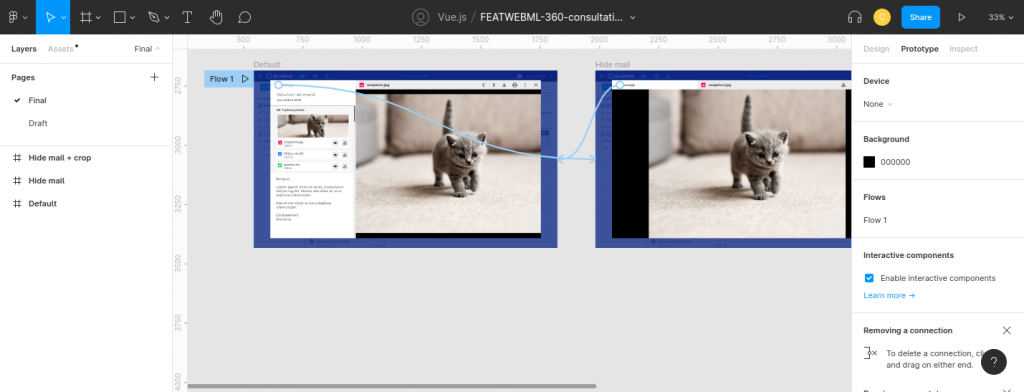
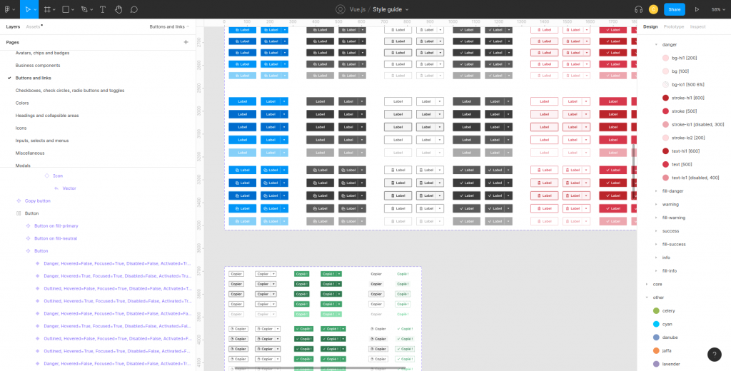
For our prototypes we use a graphical editing and interface design solution – Figma. This application lets us carry out all kinds of graphical design projects, from websites to mobile application interfaces to model prototyping.
Below is an overview of a Figma workflow for our attachment viewing example:
Mock-ups help us to:
- Choose the properties that may impact a component’s display(mouse hover, keyboard only, disabled, small or large, a warning display or an action confirmation, etc.).
- Play out interactions (what happens when I click somewhere, animations, etc.).
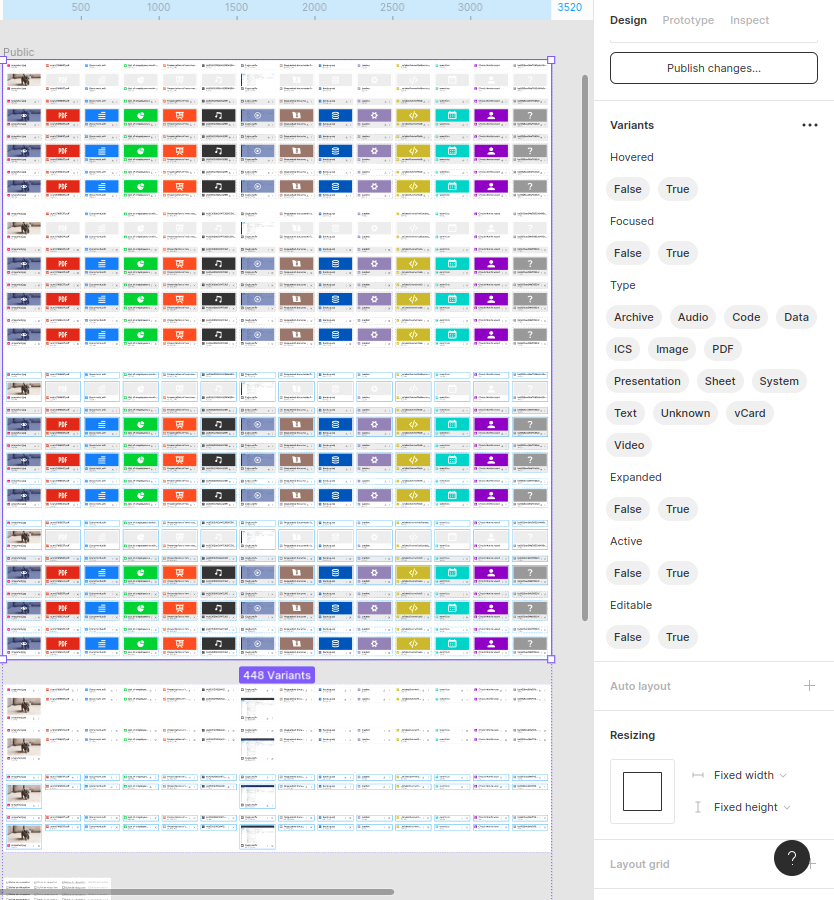
The number of mock-ups generated is huge – over 2,000 for our webmail – and in particular for some features and components:
In parallel, our teams use a range of tools such as Google Lighthouse, Axe or Wave to assess accessibility, i.e. compliance with standards for disabled people.
- Consistent features, ergonomics and graphics
The mock-up stage also helps to make sure that new developments are consistent with existing ones (old mail system) and competitors’ products (Outlook, OWA, and Gmail – to a lesser extent as it is not enterprise-focused and has a different target market).
We also make sure that access to features is consistent across all screens and application contexts (through reusable components, Lego brick-like).
Finally, everything must be consistent with the graphic charter (visual identity, colour consistency, fonts, icons, weight, sizes, shapes, spacing and animations) so that it all blends into BlueMind’s DNA.
When it comes to mobile devices, screen size isn’t the only issue. They give rise to idiosyncratic uses, specific behaviours, and different habits and constraints. For example, there’s no right-click on a smartphone – while there are specific gestures such as swiping –, a user’s hand may block their screen, some areas may be easier to reach than others, ambient light may change and make some parts more difficult to read, etc.
- Weekly UX round-ups and ergonomics audits
In parallel to all these ongoing processes, we have weekly meetings we call “UX Round-Ups” where everyone involved with product ergonomics and display gets together, as well as anyone else who might be interested. These meetings are designed to:
- Go over user journeys using interactive mock-ups,
- Identify aspects that may have been overlooked, technical constraints, possible rifts with existing systems or target needs.
We also carry out regular ergonomics, accessibility (keyboard navigation, contrast ratios, WCAG directive compliance) and mock-up compliance audits. The issues identified, as well as the bugs reported both internally and externally, are introduced into the design process at several levels:
- Uses cases – if user needs have to be re-examined,
- Mock-up – if the issue touches on a graphical component,
- Direct development for any other topic.
- The style guide
One final key resource we rely on to ensure the best quality levels for every new development and the solution’s UX’s overall consistency is our style guide – a repository for our graphical components.
Our UX Designers rely on the rules laid out in the style guideto write new specifications. For example, the minimise-the-number-of-clicks rule encourages them to try and come up with efficient features and avoid tedious processes involving a series of windows and forms.
The Figma style guide’s counterpart is the Storybook which holds the corresponding Vue.js components used in the code. This is what makes everyone’s work easier, makes sure everyone is on the same page and that the screens developed are consistent with the Figma mock-ups.
This is also what allows us to create dynamic mock-ups with the components actually used in the application.
The style guide therefore serves both as a best practice guide and a reusable component library for all players in the solution.
- Development, integration and rollout
Once the specifications and mock-ups are validated, BlueMind’s “typical” development and integration process begins:
- Costing with the technical team and the designer
- Setting priorities based on costing, planning, client requests and company strategy
- Development –single-user tests, integration tests and code revisions
- In-house use and end-to-end tests
- Hot fixes as required
- Rollout to clients
- Support
Check out this other blog article to find out more about our DevOps and continuous integration approach.
UX, constant work in progress
BlueMind’s raison d’être is to offer people solutions they will want to use everyday. Usability and user buy-in are what drive our developments, and we are always trying to come up with ways to improve the number one business tool!
Being a software publisher means constantly working to make our solution better. New features, architecture evolutions, staying at the state-of-the-art, optimising performance, reducing technical debt… our mission never ends!
As the only natively Outlook compatible solution, with the best Thunderbird, iOS and mobile support and now a webmail application designed to emulate thick clients, BlueMind is unquestionably user centric.
Remember: Clients don’t want source code, they want a solution.